The Contrarian Trader
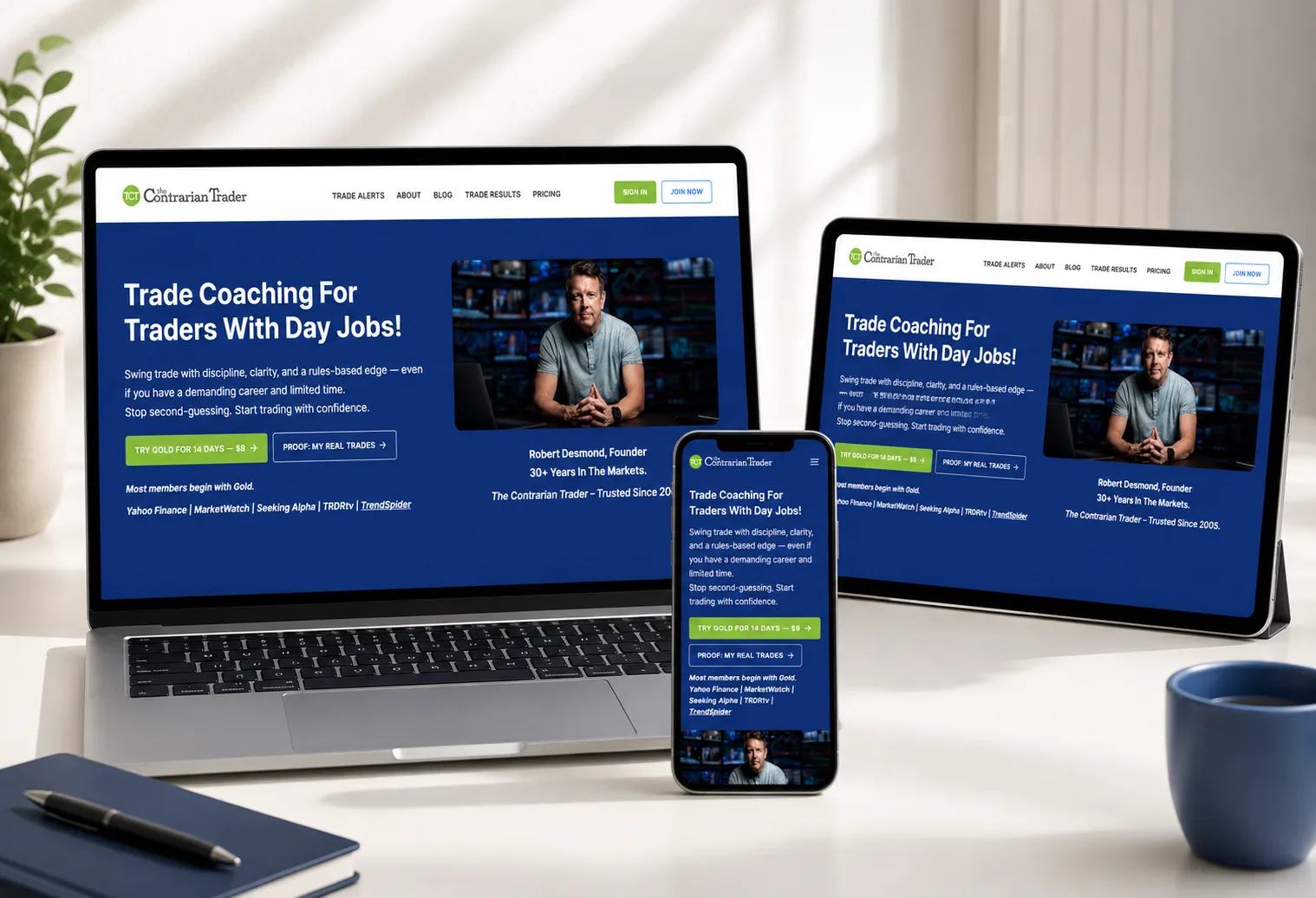
Trading with structure, not noise. A complete UX and UI redesign for a trading platform built around clarity, accessibility and better decision-making, combining market analysis, trade alerts, performance tracking, coaching, community and member resources in one place.
Overview
01
Redesigning the Experience Around the Trader
The Contrarian Trader had grown into a substantial digital platform. It brought together market insights, trade alerts, performance information, education, memberships, coaching, community and other trading resources.
The amount of information was not the problem. The way it was presented was. The member dashboard had become cluttered and difficult to scan, important information was not always immediately visible, and secondary content competed for attention. The redesign focused on one idea: make the right information easier to find at the right moment.
Challenge
02
The Information Was There. The Experience Was Not.
Users could see a lot, but they could not always tell what mattered first.
The Contrarian Trader had a lot to offer its users, but more functionality also meant more opportunities for the interface to become complicated. The dashboard had accumulated information and features without a sufficiently clear hierarchy.
What the redesign had to solve
- Clutter in the member dashboard, with too little separation between primary and secondary content
- A weak hierarchy, where important trading information did not stand out from supporting content
- Navigation complex enough that users had to learn where features and resources lived
- Fragmented flows, where related information and actions were not connected intuitively
- Inconsistent UI patterns across different parts of the platform
- Information duplicated in more than one place
- User journeys carrying steps that earned nothing
- Content that was difficult to find at all
- A dashboard built for static screens rather than changing, member-specific data
Role
03
My Responsibilities
The complete UI/UX design, with the build handled alongside it.
UX & Information Architecture
Identify the usability problems, rethink how users move through the platform, and organise its content and functionality into a clearer structure.
Navigation & User Flows
Map and redesign the important journeys, and build a navigation system around user priorities and the areas people reach for most.
UI & Dashboard Design
Design the complete visual interface across website and dashboard, with a stronger hierarchy, easier scanning and layouts that hold across screen sizes.
Developer Collaboration
Work directly with the developer to translate the static UI into a dynamic dashboard, and refine the screens where the built product differed from the design.
Solution
04
Solution & Key Features
From clutter to hierarchy: organising the information rather than removing it.
Website Redesign
A stronger visual hierarchy and consistent interface patterns, so users can understand the platform without processing everything at once: clear headings, grouped content, consistent components, obvious calls to action and better responsive behaviour.
Navigation Redesign
Rethought around how the platform is actually used. Rather than treating every section equally, the structure prioritises what users need most and groups related functionality, a guide rather than a directory.
User Flow
The platform mapped from the user's perspective, so the interface answers what is happening in the market, which trades to look at, how they are performing and what to do next without anyone thinking about the site's structure.
Member Dashboard
The biggest UX problem, rebuilt in three tiers: what matters now, what I can do, and what else is available. The dashboard becomes a place to orient, understand and act.
Designed for Dynamic Content
Not a set of static mockups. The UI was designed around active and closed trades, performance data, market updates, alerts, empty and loading states, varying content lengths and member-specific information.
Consistent UI System
One visual language across website and dashboard, so the platform reads as a single product rather than a collection of interfaces built at different stages.
Process
05
Implementation Process
Understand the problem before changing the pixels.
- 01
Audit
Review the existing website and dashboard for usability and visual problems: clutter, confusing navigation, weak hierarchy, duplicated information, unnecessary journeys, content that was hard to find, inconsistent UI patterns and dashboard overload.
- 02
Map & Prioritise
Map the major sections, features and journeys to see how the parts should relate, then decide what belongs in front of the user, what stays secondary, and what can move deeper into the experience.
- 03
Restructure
Redesign the information architecture, navigation and user flows before any detailed interface work begins.
- 04
Design & Validate
Build the complete website and dashboard UI (layouts, typography, colour, components, cards, tables, forms, states and responsive breakpoints) and check the dashboard against real content rather than ideal placeholder data, so long values and changing amounts of information still fit.
- 05
Collaborate & Refine
Work with the developer through implementation, discussing the technical behaviour the dynamic dashboard needed, then review the built screens and refine spacing, hierarchy, interactions and responsive behaviour where they differed from the intent.
Benefits
06
Results & Benefits
Less noise, and more useful information.
For Members
- Important areas reachable without learning the platform first.
- Primary information given more weight than secondary.
- A dashboard with a clear starting point.
- Related information and actions in a logical sequence.
- Clear visual entry points instead of a wall to interpret.
For the Product
- Shared patterns across website and dashboard.
- One coherent product rather than several interfaces.
- A hierarchy that survives new content being added.
- Depth kept intact, and made navigable.
- An interface that adapts complexity to the user.
For the Build
- UI designed with implementation in mind.
- States accounted for, not only ideal screens.
- Real data considered before handoff, not after.
- Behaviour agreed with the developer during design.
- Built screens reviewed and refined against the intent.
Impact
07
What the Redesign Set Out to Change
The outcomes the work was built to produce.
Structured
Information organised by importance and context rather than by the page it happened to live on.
Easier to Scan
The dashboard offers clear visual entry points instead of asking users to interpret it.
Clearer Priorities
The most important information carries the strongest hierarchy.
Connected Flows
Related features and information are easier to move between.
Consistent UI
Repeatable patterns make the platform feel like one product.
Built for Real Data
The dashboard holds together as its content changes, rather than only in its ideal state.
08
What the Interface Now Answers
The questions the journeys were redesigned around.
What is happening in the market?
Market insights and analysis.
What trades should I look at?
Trade alerts and trade information.
How are those trades performing?
Performance information.
What do I have access to?
Membership and account information.
Where do I go next?
Clear contextual actions.
09
Turning Complexity Into Clarity
A dashboard that holds its shape as the content moves.
- Active trades
- Closed trades
- Performance data
- Market updates
- Alerts
- Empty states
- Loading states
- Different content lengths
The redesign changes the role of the interface. Instead of making users adapt to the platform's complexity, the interface adapts that complexity to the user: the information stays powerful, and the experience becomes simpler.
Details
Show supporting detail (2)
10
One Visual Language Across the Platform
The shared components the redesign standardised.
- Cards
- Buttons
- Tables
- Data blocks
- Navigation
- Forms
- Status states
- Content sections
- Responsive design
- Mobile-first usability
- Strong visual hierarchy
- Clear CTA placement
- Fast content discovery
- Structured service presentation
- Trust proof integration
- Conversion-focused navigation
- Accessible information architecture
11
Project Snapshot
The project at a glance.
| Category | Details |
|---|---|
| Project | The Contrarian Trader |
| Industry | Trading / Financial Education |
| Business Model | Membership & Trading Education |
| Platform | WordPress / Kadence |
| Primary Audience | Traders & Members |
| Core Offering | Alerts, Analysis, Performance & Education |
| Project Focus | UX / UI Redesign + Member Dashboard |
| Role | UX / UI Designer |
FAQ
12
Frequently Asked Questions
The questions this project usually raises.
What was your role on The Contrarian Trader?
UX/UI designer, responsible for the complete website and member dashboard design: information architecture, navigation, user flows, visual design, responsive layouts and the dashboard UI.
Did you develop the WordPress website?
No. The site was designed within the WordPress and Kadence environment, while development and the dynamic implementation were handled in collaboration with the developer.
What was the biggest problem with the original dashboard?
It was cluttered and gave no clear hierarchy for the information users needed. Too many elements competed for attention, which made the whole thing difficult to scan.
How did you handle dynamic dashboard content?
The UI was designed around real content scenarios and different data states rather than ideal placeholder screens, and the behaviour was agreed with the developer so that dynamic content could fit the design system.
What was the main goal of the redesign?
To make a complex trading platform easier to understand, easier to navigate and faster to use, without removing the information and functionality traders depend on.
Does your product feel too complex?
Your users should not have to learn the interface before they can use the product. Good UX does not remove complexity from the product; it removes unnecessary complexity from the experience.
When a product holds a lot of information, the answer is rarely to show less of it. It is better hierarchy, better grouping and better flow.
Start a Project
Send me yourcomplicatedproblem.
- Full-time roles
- Freelance & consulting
- Remote friendly
- Replies within 24 hours